Multinational Profit P&L Visualization Risk Dashboard Matrix analysis Porter's forces analysis
Data-driven Map Custom Map / Sales territory Oil company operating reporting Sorbonne University
All these examples can be done with the FREE version of BeGraphic
that you can download on the page : "Download / Lite version"
Multinational Profit
![]()
![]()
![]()
With BeGraphic, you can enhance your dashboards, reporting documents, presentations and scorecards with innovative visual data graphics... as easy as with your old Excel charts.
Once you have built advanced dashboards(*), it can be diffused to your collaborators/partners and automatically updated with new data.
* e.g. types of excel charts, graph templates and data visualization (graphical representation) : custom data graphics, cascade chart / waterfall chart, marimekko / mekko chart, sankey diagram, dynamic diagram, pivot diagram, powerpivot charts, pivot chart, ishikawa cause-effect diagram, BCG matrix, ADL matrix, McKinsey 7S, RB profiler, DuPont chart, choropleth map, swot analysis model, vector glyph, bubble race, business chart, business graph, business graphics, professional excel chart and any innovative charts, powerpoint, power point, powerpoint templates, power point templates,ppt templates, powerpoint presentations, powerpoint diagrams, powerpoint backgrounds, powerpoint graphics, powerpoint cliparts, powerpoint download, powerpoint charts, powerpoint maps, powerpoint library, ppt, presentation, Strategic Performance Manager, Procurement performance management processes, Strategy Deployment process, Procurement strategic performance management processes and tools, yearly strategic objectives setting process (Strategy Map, Objectives & related KPI’s), customized data graphics, global common procurement performance review process
P&L Visualization
![]()
![]()
![]()
![]()
With BeGraphic, you can build dynamic diagrams (pivot diagram) to effectively illustrate a process or how the parts of something relate to the whole.
Here is the famous DuPont chart, which was originally created by the chemical company DuPont de Nemours to visualize contributions of each line of the Profit & Loss. Our version is enriched with dynamic lines (colors and size) to explain where the variance versus budget is important.
Once your custom chart(*) is built, the update can be done by anybody just by entering the new data.
* e.g. types of excel charts, graph templates and data visualization (graphical representation) : power point templates, specific Visio shape or stencil, ascade chart / waterfall chart, marimekko / mekko chart, powerpoint presentations, visio drawing productivity, collection of visio stencils and templates, mapshapes, sankey diagram, custom data graphics, dynamic diagram, pivot diagram, powerpivot charts, ppt templates, pivot chart, diagrams, charts, and data visualizations, ishikawa cause-effect diagram powerpoint backgrounds, BCG matrix, ADL matrix, McKinsey 7S, RB profiler, DuPont chart, business chart, business graph, powerpoint maps, business graphics, professional excel chart, strategy map, dashboard software, motion chart in PowerPoint and any innovative charts powerpoint, ppowerpoint templates, audits reports and controls to ensure Sarbox compliance for Procurement, powerpoint diagrams, Ensuring the quality improvement and deployment of IT tools related to performance measurement, powerpoint graphics, better than visio customized data graphics, Data Graphics window, TaskMap Data Graphics, TaskMap Professional, pre-built Data Graphics, low cost alternative to CAD systems like AutoCAD, MicroStation, ProE, Pivot Diagrams, pivot table, DataLink, Geographic Information Systems (GIS), MapShapes, visual automation, create, maintain, and deploy diagrams and drawings, custom data visualization, powerpoint cliparts, definition and follow-up of their KPI’s, powerpoint charts, Procurement performance can be measured, ppt, visualizing information, data-driven flowchart, Vector-Graphic software, organization diagram, flowchart, diagram, cad, autocad, visual dashboard in excel, data visualization in excel, data graphics in powerpoint, visualize information in excel, linking visio and excel, presentation, global performance review process, powerpoint download, CMMI, ITIL, ITG, ITOS, SMM, Six Sigma, IT Governance, Business Process Management, IT governance maturity using Cobit, Val IT and ITIL as reference frameworks,IT strategy,program management,eSCM – CL, CMMI, Prince2, PMBOK standars,service governance and ITIL process definitions, Knowledge of ISO 20K ,Certified ITIL Practitioner / Masters / Expert highly desirable, Six Sigma, 6 sigma
Risk Dashboard
![]()
![]()
![]()

![]()
With BeGraphic you can organize your KPI into a self-made representation(*) which allows you and your partners to access to the appropriate information and make decision quickly. Here is an Ishikawa diagram, also known as the cause-effect diagram.
It is nearly impossible to communicate today without using shapes to symbolize various types of relationships and their interactions.
* e.g. types of excel charts, graph templates and data visualization (graphical representation) : ishikawa cause-effect diagram, custom data graphic, BCG matrix, ADL matrix, McKinsey 7S, RB profiler, DuPont chart, choropleth map, swot analysis model, vector glyph, business chart, business graph, powerpoint diagrams, business graphics, professional excel chart, powerpoint charts, Integrates specific national requirements while maintaining standardized global reporting, powerpoint maps,performance review processes,custom data visualization, better than visio customized data graphics,supporting and tracking the achievement of strategic objectives through the monitoring of strategic performance indicators, mini-graphs, micro-charts, improve effectiveness of Procurement to ensure Compliance, sparkline for excel, Performance Review process, excel gauges, Procurement Leadership Team, strategic maps, Supports the strategic deployment process on a global scale, strategy map, complete performance review report, dashboard software in PowerPoint or in excel2010, implementing the appropriate tools to consolidate and visualize the KPI’s, specific Visio shape or stencil, design stencil set, visio drawing productivity, collection of visio stencils and templates, mapshapes, freeforms, create spectacular maps, diagrams, charts, and data visualizations, present and communicate critical business and technical information,Create compelling presentations, reports, and plans, view dynamically changing data in Visio to enable you to respond more quickly to shifting business conditions, share maps with colleagues on the Web, A data graphic is a set of enhancements that you can apply to shapes to show data that the shapes contain. A data graphic presents your data as a combination of textual and visual elements, such as flags and progress bars, process maps, Data Graphics window, TaskMap Graphics, TaskMap Professional, pre-built Data Graphics, low cost alternative to CAD systems like AutoCAD, MicroStation, ProE, visual automation, create, maintain, and deploy diagrams and drawings, pre-made symbols, drawing templates, flow chart, organization chart, organisation chart, network and IT diagrams, HVAC industry, Pivot Diagrams, pivot table, DataLink, Geographic Information Systems (GIS), MapShapes, Microsoft, Microsoft Access, Microsoft Excel, Microsoft Powerpoint, Microsoft SharePoint, Microsoft Word, ShapeData, ShapeLink, US Census Bureau, Visio Stencils, Shape Data, Data Graphic, visualizing information, data-driven flowchart, Vector-Graphic software, organization diagram, flowchart, diagram, cad, autocad, visual dashboard in excel, data visualization in excel, data graphics in powerpoint, visualize information in excel, linking visio and excel, CMMI, ITOS, SMM, ITIL, ITG, SixSigma, Business Process Management, IT Governance, IT governance maturity using Cobit, ITIL as reference frameworks, IT strategy, program management, eSCM – CL, CMMI, Prince2, PMBOK standars, service governance and ITIL process
Matrix analysis
![]()
![]()
![]()
![]()
With BeGraphic you can built your own dynamic visual analysis model in few minutes.
Once you have chosen your model(*) using the many types (GE/ McKinsey matrix, Arthur D. Little matrix / ADL matrix, Gartner Magic Quadrant, Roland Berger RB profiler...), use BeGraphic to built your own customization.
* e.g. types of excel charts, graph templates and data visualization (graphical representation) : Boston Consulting Group matrix, ensuring alignment of KPI calculation methods, challenging on the contents of the reporting and checking harmonization of reporting methods, ADL matrix, structure and improve KPI tools, McKinsey 7S, benchmarking opportunities of benefit to Procurement by gathering industry benchmark data from external databases and organizations against which Procurement performance can be measured, RB profiler, custom data graphic, DuPont chart, deployment of strategic performance processes, swot analysis model, Integrates specific national requirements while maintaining standardized global reporting, vector glyph, implementation of the strategic performance review processes, business chart, performance review processes, business graph, business graphics, professional excel chart, organisation chart, more flexible than visio data graphics, mini-graphs, micro-charts, sparkline for excel, excel gauges, strategic maps, strategy map, dashboard software, bubble race, motion chart, trend analyzer, scada system, powerpoint charts, powerpoint maps, control room...
Porter's Forces Analysis
![]()
![]()
![]()
![]()
Once you have chosen you data visualization(*), you can optimze it the way you want. Here is a vector glyph / star glyph showing Michael E. Porter's five forces model. In fact here this visual representation is the updated model, showing a sixth force created by Brandenburger and Nalebuff (used by Intel and Microsoft). With BeGraphic, you can mix different types of data visualisations to get the most appropriate representation for each information you analyse.
PowerPoint and Excel will become so spectacular and original that your colleagues will be impressed... and the magical thing is that every time you change data, the visual representation will be updated.
* e.g. types of excel charts, graph templates and data visualization (graphical representation) : cascade chart / waterfall chart, marimekko / mekko chart, Strategic Performance Management, custom data graphics, sankey diagram, achievement of strategic objectives through the monitoring of strategic performance indicators, dynamic diagram, performance management processes, pivot diagram, Strategy Deployment process, powerpivot charts, strategic performance management processes and tools, pivot chart, yearly strategic objectives setting process (Strategy Map, Objectives & related KPI’s), ishikawa cause-effect diagram, performance review process and reporting, BCG matrix, definition and follow-up of their KPI’s, ADL matrix, more dynamic than visio data graphics, alignment of KPI calculation methods, challenging on the contents of the reporting and checking harmonization of reporting methods, McKinsey 7S, RB profiler, structure and improve KPI tools, DuPont chart, choropleth map, benchmarking opportunities of benefit to Procurement by gathering industry benchmark data from external databases, swot analysis model, vector glyph, business chart, business graph, business graphics, professional excel chart, strategic maps, strategy map, dashboard software, ppt templates, powerpoint presentations, powerpoint diagrams, moving bubble, motion chart, trend analyzer, scada system, control room...
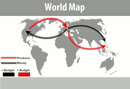
Data-driven Map
![]()
![]()
![]()
![]()
BeGraphic is able to animate not only shapes and freeforms, but also photos and pictures, using size, border's color... to represent various state of an evolution.... still depending on your Excel's data! Here is a dynamically colored map, also known as a choropleth map.
Once your data viz(*) is drawn, your secretary will only need to select/key in the right data and BeGraphic will automatically refresh the colored map (as does Excel's charts when you change your values inside cells).
* e.g. types of excel charts, graph templates and data visualization (graphical representation) : choropleth map, swot analysis model, vector glyph, deployment of strategic performance processes, business chart, business graph, implementation of the strategic performance review processes, business graphics, data graphics, performance review processes, organisation chart, oragnization chart, flexible data graphics, more flexible than visio data graphics, professional excel chart, mini-graphs, micro-charts, sparkline for excel, excel gauges, make a custom map in Excel, thematic map in PowerPoint, dynamic sales territories, mapping tool, geographical information system in excel2010, choropleth map, and any innovative charts, Strategic Performance Manager supporting and tracking the achievement of strategic objectives through the monitoring of strategic performance indicators, yearly strategic objectives setting process (Strategic Map, goal & related KPI’s)...
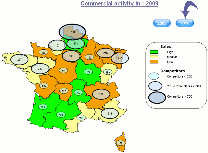
Custom Map / Sales territory
![]()
![]()
![]()
![]()
Would you like a map showing the real sales areas color-coded with monthly figures?
Now you can draw in 5 minutes any home-made map that will match your business reality. With BeGraphic, you are no longer bounded to usual administrative maps.
Once your data visualisation(*) is drawn, users will only need to select the right data in order to make BeGraphic automatically refresh the coloured map (as does Excel's graphs when you change your values inside cells).
* e.g. types of excel charts, graph templates and data visualization (graphical representation) : cascade chart / waterfal chart, ripple effect animated, marimekko / mekko chart, sankey diagram, dynamic diagram, pivot diagram, powerpivot charts, pivot chart, ishikawa cause-effect diagram, BCG matrix, data graphics, ADL matrix, McKinsey 7S, RB profiler, DuPont chart, choropleth map, pie chart data-driven, swot analysis model, vector glyph, business chart, business graph, business graphics, pie chart focus, professional excel chart, custom data graphics, mini-graphs, micro-charts, sparkline for excel, excel gauges, strategic maps, strategy map, dashboard software, moving bubble, motion chart, trend analyzer, scada system, control room, scrum process, flowchart visual, arrow box diagrams, swot, cycle diagram, speedometer, 3d charts data driven gold, powerpoint usa map, templates, maps, curved arrows, chevron diagramcause and effect, make a custom map in Excel, more powerful than visio data graphics, thematic map in PowerPoint, dynamic sales territories, mapping tool, geographical information system in excel2010, choropleth map, and any innovative charts...
Operating Reporting
![]()
![]()
![]()
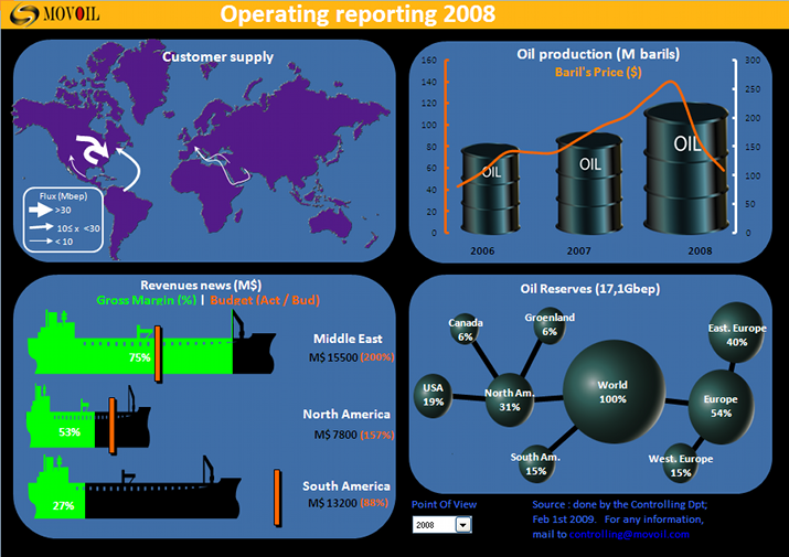
For a project to remain hidden, we made a "glass cockpit" dashboard, providing all crucial data in a single screen.
The main indicators are all on one page PowerPoint presentation style, but with the automatic refresh on data from the spreadsheet.
Thus the update is automatic for all users who bought a Business Intelligence tool including an Excel add-in (e.g.: Microsoft PowerPivot, Oracle Hyperion, Hyperion Essbase, IBM Cognos TM1, SAP BW, Infor Alea, Palo Jedox ...). But the most important thing in this dashboard is the ease of understanding of the specific graphs especially made for this company. Until BeGraphic, only newspapers could afford to hire infographics experts to create new types of data representation. Now you can do it by yourself !
supporting and tracking the achievement of strategic objectives through the monitoring of strategic performance indicators, sankey diagram, strategic performance management processes and tools, dynamic diagram, pivot diagram, marimekko / mekko chart, powerpivot charts, pivot chart, iDuPont chart, choropleth map, swot analysis model, vector glyph, yearly strategic objectives setting process (Strategy Map, Objectives & related KPI’s), custom data graphics, Supports the strategic deployment process on a global scalebusiness chart, business graph, professional powerpoint chart, mini-graphs, micro-charts, sparkline for powerpoint, powerpoint gauges, strategic maps, strategy map, dashboard software, moving bubble, motion chart, trend analyzer, scada system, data graphics, definition and follow-up of their KPI’s, control room, make a custom map in powerpoint, thematic map for PowerPoint, data-driven sale territory, implementing the appropriate tools to consolidate and visualize the KPI’s, ripple effect animated, pie chart data-driven, cause and effect, scrum process, flowchart visual, arrow box diagrams, cycle diagram, 3d charts data driven, curved arrows, chevron diagram, mapping tool, implementation of the strategic performance review processes, performance can be measured, performance review processes, more flexible than visio data graphics, deployment of strategic performance processes, GIS in powerpoint 2010, choropleth map, and any advanced charts...
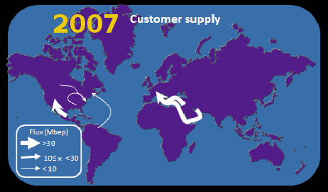
Sorbonne University
![]()
![]()
![]()
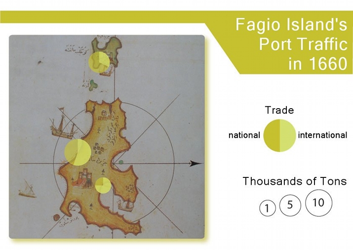
One of the most prestigious universities in the world uses BeGraphic in its Department of History to make presentations with dynamic maps. The department bought the data visualization tool in order to mix sparklines and color-coding layers on top of old background maps. This technique enhances the map with additional information to convert it into a powerful info graphics tool.
L'universite de la Sorbonne in Paris was founded in 1253. During the last 750 years, it grew into a major centre of learning and became the core of what would become the University of Paris. Among the people who have worked there include Erasmus, Ignatius of Loyola, John Calvin, John Knox, Boileau, Bergson, Pierre and Marie Curie, Derrida.